Back to blog
Copenhagen Blog
Mocha Mousse: How to Incorporate Pantone’s Color of the Year into Your Home
Each year, Pantone crowns its Color of the Year, “a single, distinct hue” they feel best represents a collective global mood. Indeed, Pantone’s program has become its own shared experience, with many waiting in anticipation each December for the reveal; perhaps just for fun or for the way it makes us think about the emotional nuance of color. This year’s pick, Pantone's "Mocha Mousse," feels surprisingly comforting and delightfully versatile – a winning combo for interior designers and color enthusiasts alike. But you don’t have to be either to take bring "Mocha Mousse" into your home, which Pantone describes as “a warming, brown hue imbued with richness” that represents a “global mood of connection, comfort, and harmony.” Below, we dive deep into what makes this hue a new staple neutral, and how you can incorporate it into your living space.

As mentioned in our 2025 Design Trends blog, many of us are seeking an inviting, down-to-earth feel in our living spaces this year, through furnishings and design choices that feel both comfortable and grounding. A warm, earthy hue fits right in with this desire, evoking images of that first sip of morning coffee or final bite of decadent chocolate. Its sensory effects give it the ability to define a space with statement pieces or provide a versatile foundation for a wide range of interior design styles – crowning it with staple neutral status.
Still, for all its simplicity, “Mocha Mousse” has an understated elegance that can add a touch of luxury through a leather chair and abstract vase or infuse a space with homey coziness through a warm wood table and plush carpet. Full of depth and possibility, this timely tone might just become your go-to classic.

The versatility of “Mocha Mousses” makes it an ideal foundational tone for any interior, able to complement a variety of design styles in different room types. Below, discover four Pantone-suggested color palettes for your living room, bedroom, dining room, and office that use this year’s feature color to create a distinctive mood and harmonious feel.
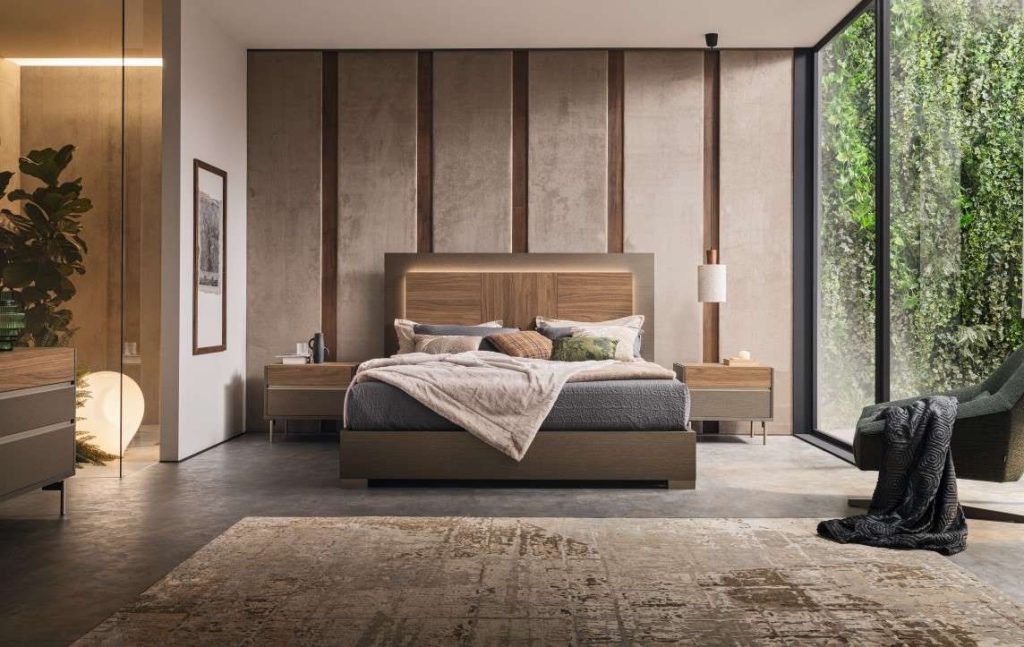
Pantone Colors In Palette: Mocha Mousse, Desert Flower, Cattleya Orchid, Opera Mauve, Blue Curacao, Spicy Mustard & Arabesque
Truly unique, this color palette from Pantone mixes vibrant warm and cool tones with a a rich brown for a space that feels energizing and soothing all at once. Start off strong with a sofa or sectional in the palette’s bolder tones of lagoon blue (like the Alder) or vibrant mustard; consider pairing with a chocolate brown or cognac side chair or recliner to keep your space feeling grounded. Feel free to mix materials as well, but ensure each piece contributes to an overarching feel; though the lively yellow fabric of the Cullin sofa contrasts with the tan leather of the Siesta chair, both exude a touch of coziness. To introduce exotic orchid, pale mauve, or sky blue more subtly, try incorporating a few small accessories in your living space, whether it be a sculpture, wall art, or bright throw pillow like Anneli. Placing a pair of fun vases like Adrie on a natural wood coffee table like Jamison creates a balanced yet dynamic look – the ultimate goal of this color palette.
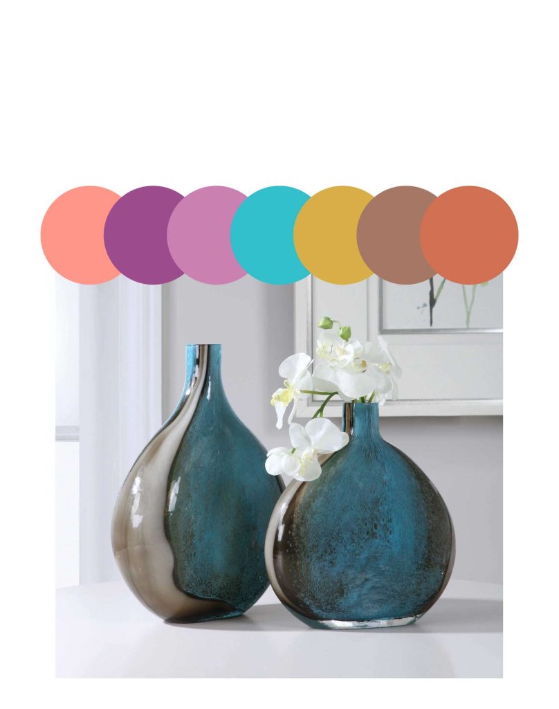
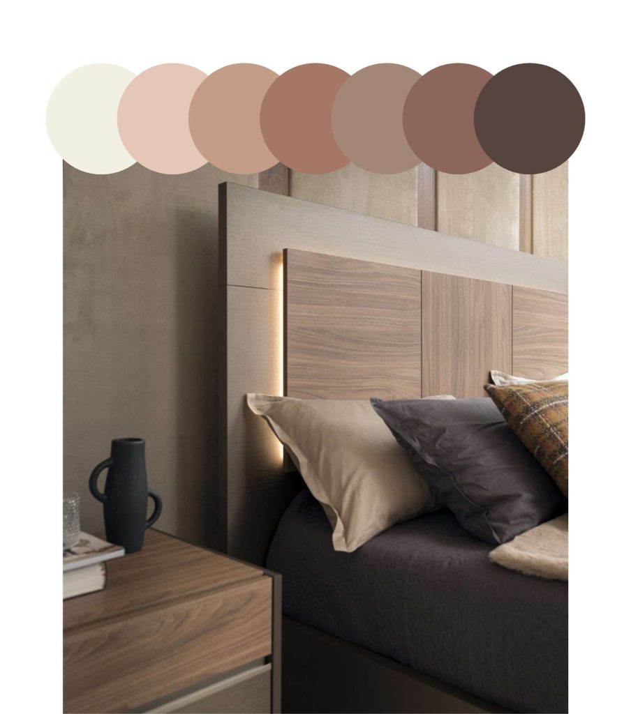
Pantone Colors In Palette: Mocha Mousse, Cannoli Cream, Cream Tan, Safari, Sirocco, Chanterelle, Baltic Amber & Chocolate Martini
Simple yet rich, this Pantone palette uses a variety of complementary neutral tones to inspire relaxation and comfort – perfect for a bedroom. For your larger furnishings, consider pieces that feature multiple colors from this palette to add depth and keep your space from feeling monochrome. With its tiered headboard, the Bella Borgata bed highlights mushroom and dark brown tones through its walnut and bronze eco-veneer, while the Avita double dresser uses warm brown and ivory to offer a versatile base. Imbue your bedroom with a luxurious feel by incorporating accessories with tactile depth, like a or a bedside lamp with a textured wood or stone base. And don’t forget to indulge in the simple pleasures of a soothing artwork like Hidden Treasure; with a variety of palette hues in its misted background, this picturesque wall art will encase your bedroom in subtle warmth.
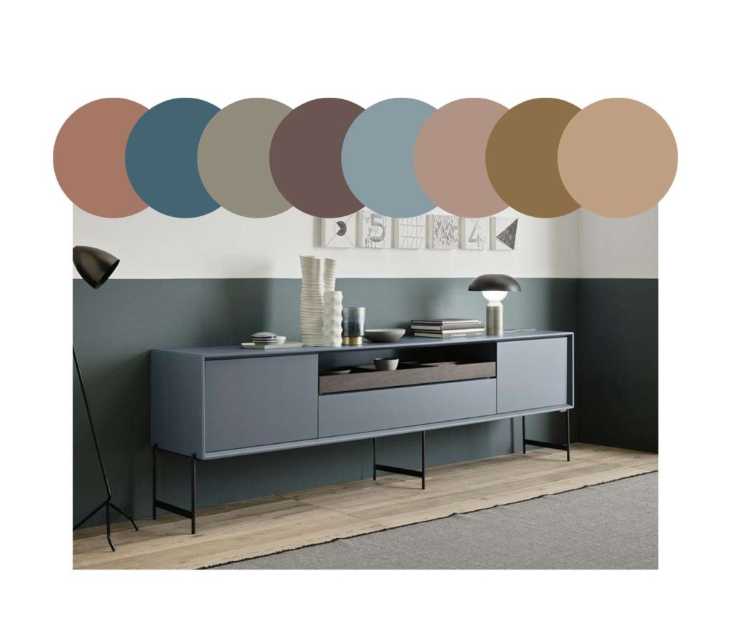
Pantone Colors In Palette: Mocha Mousse, Tapestry, Laurel Oak, Coffee Quartz, Arona, Warm Taupe, Dull Gold & Buffed Beige
This color palette is for those who appreciate how subtle color can enhance a classic wood dining space. Curated touches of earthy blues, greens, and greys accent a spectrum of sophisticated browns in buttery hues. Opt for a timeless warmth with a walnut finish dining table in your preferred shape; you can jazz it up by choosing a design with a sculptural base or accent color, like the espresso lacquer of the Rowan. Your chairs can also be predominately wood but consider adding dimension with leather or fabric seats in another tone from the palette; the layering of a warmer and cooler brown combination reflected in the Caroline dining chair feels effortlessly elegant. For this palette’s unique ocean blue, muted blue, and dark gold tones, give yourself the freedom to be flexible – some may appreciate a larger statement piece such as buffet or sideboard like Horizon, while others may prefer the subtler touch of a centerpiece, wall art, or vase.
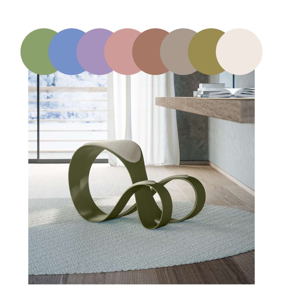
Pantone Colors In Palette: Mocha Mousse, Tendril, Cornflower Blue, Viola, Rose Tan, Cobblestone, Willow & Gardenia
In contrast to the previous palettes discussed, warm brown tones serve as a subtle grounding color amongst more energizing hues, allowing a blend of springtime accents and earthy neutrals to breathe new life into your office space. Consider a desk or work surface in a cream or warm grey like the ; these lighter colors have an airy feel that can open up a room and make it appear larger. Enhance this feeling of lightness with a similarly toned office chair or uniquely shaped alternative seating. The Moon knee chair features an ergonomic, infinity-shaped design and expertly pairs a more neutral grey with a muted green. Finding this palette’s distinctive blues, greens, and purples may be a challenge with traditional office furnishings, so focus on incorporating a few colorful accessories that enhance your space’s functionality or refreshing feel, such as a desk lamp (the Splitty LED lamp is the epitome of a pastel blue), or artwork (the Bluebells wall art features a lush forest scene imbued with purple, ochre and spring green.) Accessories can be placed on or hung above storage furnishings that utilize a brown base tone, whether that be a classic wood bookcase or high gloss credenza like Bella Nuova.
Through these color palettes, it’s evident that Pantone’s “Mocha Mousse” brings warmth and versatility that allow it to seamlessly integrate into a variety of interiors, with the potential to become a timeless neutral. The choice is yours on the degree you choose incorporate this tone into your space; any level will help foster a sense of connection and comfort. To discover more furniture and design tips, browse our blog or visit a showroom today.